
bread + butter
Vol. 01 | The Analog Issue
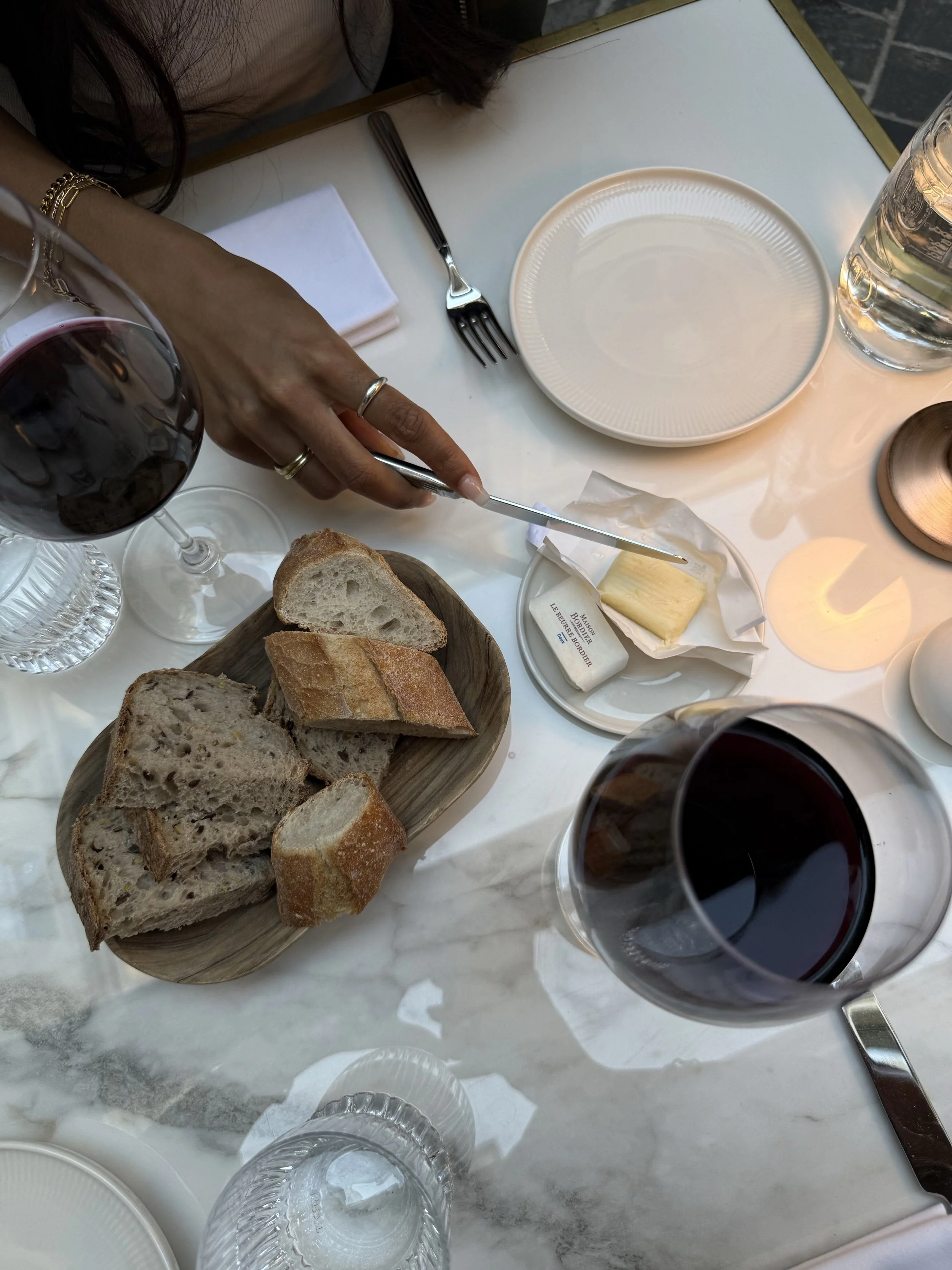
This volume was born from a craving for friction. In a world of wireless convenience and ultra-glossy digital interfaces, I found myself searching for the 'tether'—the corded headphones, the heavy paper, and the slow, deliberate rituals that remind us we are more than just users of a machine. This issue is an exploration of the beauty found in the grain.
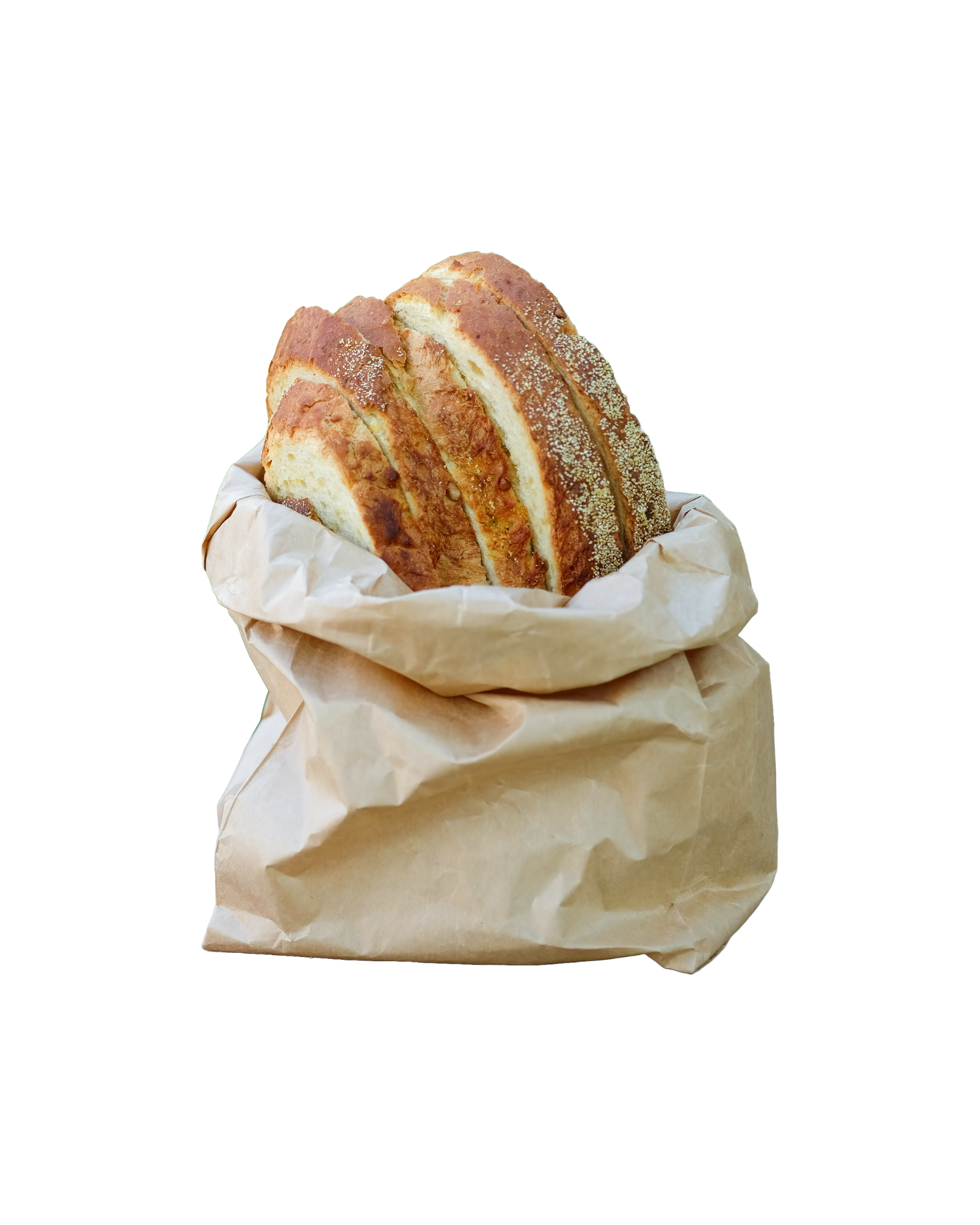
the daily bread
The Weekly Essay. Unfiltered thoughts on digital luxury, brand heritage, and the future of the human-centered web.
Lately, the view from the studio looks a lot like a digital echo chamber.
I’ve been thinking about the moment we collectively decided to start designing for algorithms instead of humans. We’ve been conditioned to prioritize the "pixel" over the "thumbprint," building digital spaces that are optimized and sanitized until they are—if I’m being honest—entirely soulless.
We are told that success depends on pleasing a piece of code that lacks the eyes to see our art or the heart to feel our intent. But we are reaching a breaking point. We are starting to miss the grain of the wood and the weight of a physical page.
We are rediscovering that "perfect" is actually quite boring, and that clarity—real, unhurried clarity—is a much higher luxury than "more."
There is a profound difference between a website that functions and a digital space that breathes.
True sophistication doesn't need to perform for a bot; it just needs to be certain. It’s the difference between a high-speed chase for engagement and a quiet, confident seat at a well-set table. We don't need more "content." We need more presence. We need to invite the human back into the machine.
observations
The Curator’s Eye. A collection of shifts I’m noticing in the wild—from fashion editorials to the return of the tactile.
The Return of the Tether.
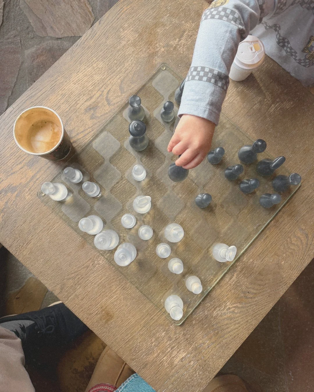
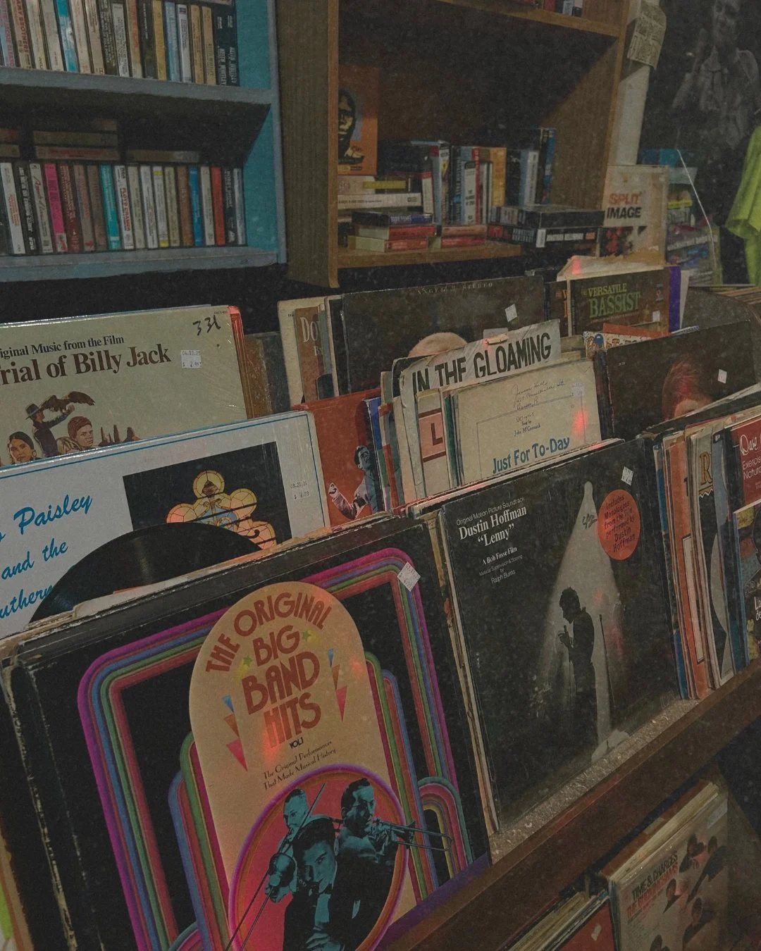
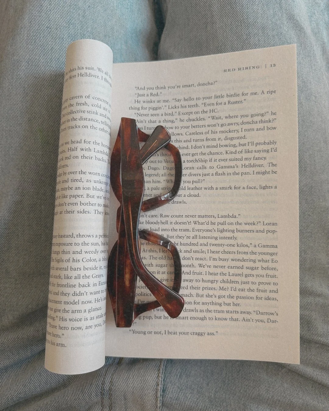
There is a quiet rebellion happening in design, and it looks surprisingly like the early 2000s. I’m noticing a massive return to corded headphones and screenless digital cameras. In a world of wireless everything, the "tether" has become a status symbol.
A cord is a physical boundary; a screenless camera is a choice to be present in the moment rather than performing for it. It’s a shift from the perceived luxury of convenience to the actual luxury of presence.
I was recently reading an article in Outlander Magazine about how Sorel is leaning into this same craving for the "unfiltered." Instead of a traditional marketing campaign, they’ve partnered with ambassadors like Arctic photographer Florian Ledoux—someone who actually tracks polar bears across frozen landscapes.
As Outlander noted, Sorel isn't asking these people to "pose" in the boots; they’re asking them to live in them and feed honest feedback back to the design studio. It’s a move away from "selling a story" and toward actually living one. It’s an extension of the design process rather than just a marketing loop.
If your website feels too sterile or "staged," it might be time to add a little grit back into the butter. The most compelling brands right now aren't the ones trying to be the most "digital"; they are the ones trying to be the most real. They prioritize the heritage of the craft over the polish of the post.
If we took away your "content" and your "links," who is your business offline?
from the pantry
The Studio Ritual. Elevated, sensory snacks and nervous-system resets to bridge the gap between Mom-mode and Creative Director.

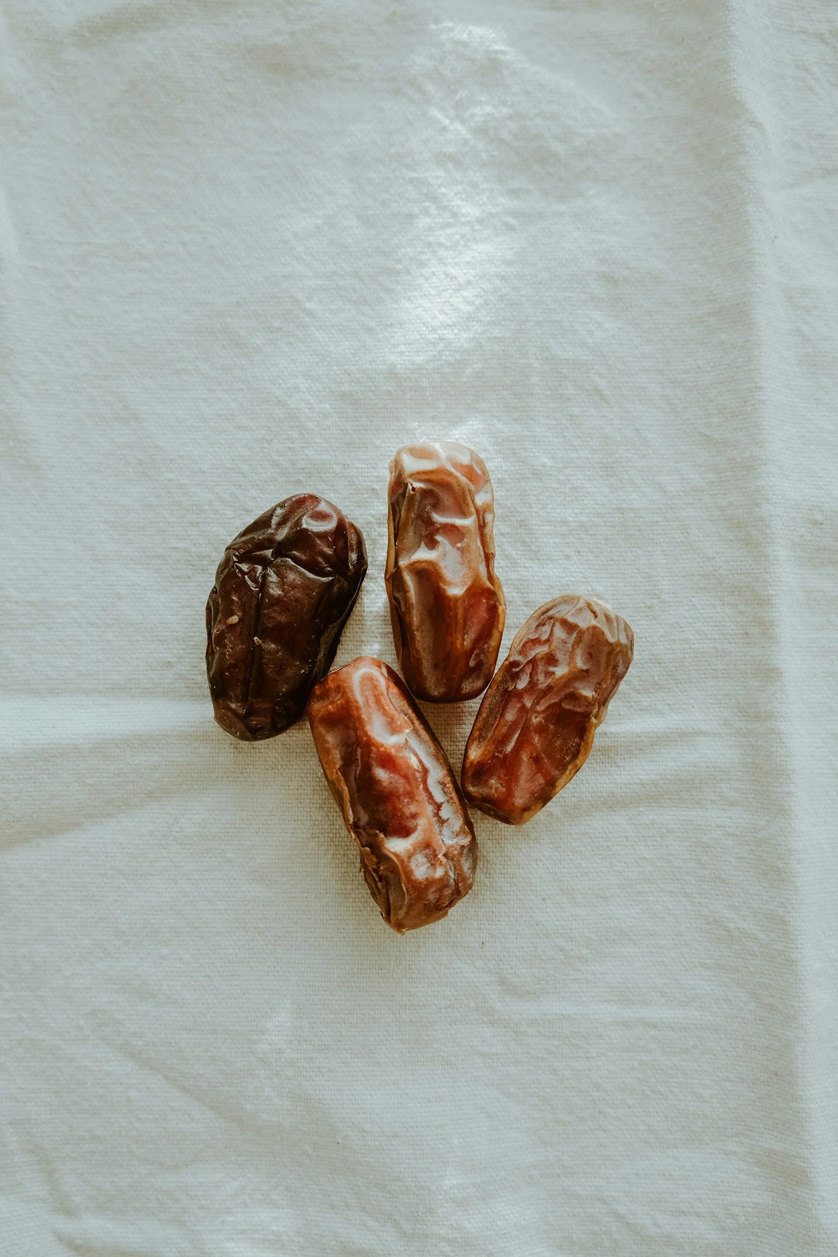
The Studio Medjool.
January is a shock to the system. Between the back-to-school hustle and the return of the "routine," we need a snack that feels less like a chore and more like a reward. This is the ultimate "yummy" studio secret—a combination that is salty, sweet, and incredibly rich. I saw this online a few months ago and haven’t looked back.
The Ritual: This is a five-minute boundary. Even if the house is loud or the inbox is overflowing, this plate is your "Analog" moment. Sit down, put your phone face-down on the table, and let the salt and sweetness reset your focus.
the cut
The Design Blueprint. Three specific aspects of visual language—type, material, and layout—that have my attention this week.
-
BETH ELLEN
(Available on Squarespace & Google Fonts)
I recently transitioned Fromage Studio over to Beth Ellen. It’s a purposeful departure from the clean, 'safe' scripts we see everywhere. It has a raw, unhurried energy—like a note scribbled on a napkin or a signature at the bottom of a letter. Using a truly organic handwriting font is the quickest way to break the 'digital wall' and remind your audience that there is a human behind the screen.
-
HEAVY-WEIGHT VELLUM
Digital luxury is found in depth. I’m currently obsessing over the translucent quality of heavy-weight vellum. In web design, we translate this through 'frosted' overlays and 70-80% opacity layers. By layering a vellum-like texture over a photograph, you soften the digital sharpness and create a 'milky' high-end finish that feels like you could reach out and peel it back.
-
THE ASYMMETRIC HEADER
I’m moving away from centered logos. This week, I’m experimenting with pushing the site navigation to the far right and the logo to the far left, leaving a massive, 'uncomfortable' amount of white space in the middle. It creates a high-fashion 'gutter' feel, like an open magazine spread. It feels confident, not crowded.
the soft edit
The Quick Refinement. A 60-second design hack to add
more soul and "thumbprint" to your digital space.
The Handwriting Overlay.
To stop your website from looking like a pre-packaged template, you need to add your physical presence.
Scribble a note on a plain piece of paper—a "hello," your signature, or even a rough star.
Take a photo of it in natural light.
Upload it to Canva, use the "Background Remover" tool, and layer it over an image. It’s the digital equivalent of signing a letter. It’s small, but it changes everything.
The Editorial Edit.
A 7-day refinement for the business owner who has officially outgrown their current digital space. We strip away the noise and polish the essentials until your website finally matches the caliber of your work.
The Investment: $777.
Current Status: Accepting two clients for the final week of January.
classifieds
The Open Ledger. Current studio openings, complimentary audits, and direct ways to work together.
The 5-Minute Self Audit.
For the woman who knows her digital space feels "off" but can't find the time to pin down why. I created a rapid-fire checklist to help you see your site through a Creative Director’s lens. No fluff, just the high-fidelity essentials. Ask yourself the right questions.
The Cost: Complimentary.
The Goal: To find the one "leak" in your brand's luxury.
p.s. i’m currently listening to Hermanos Gutiérrez on repeat while I work. It feels like a nervous system reset. See you next Sunday.
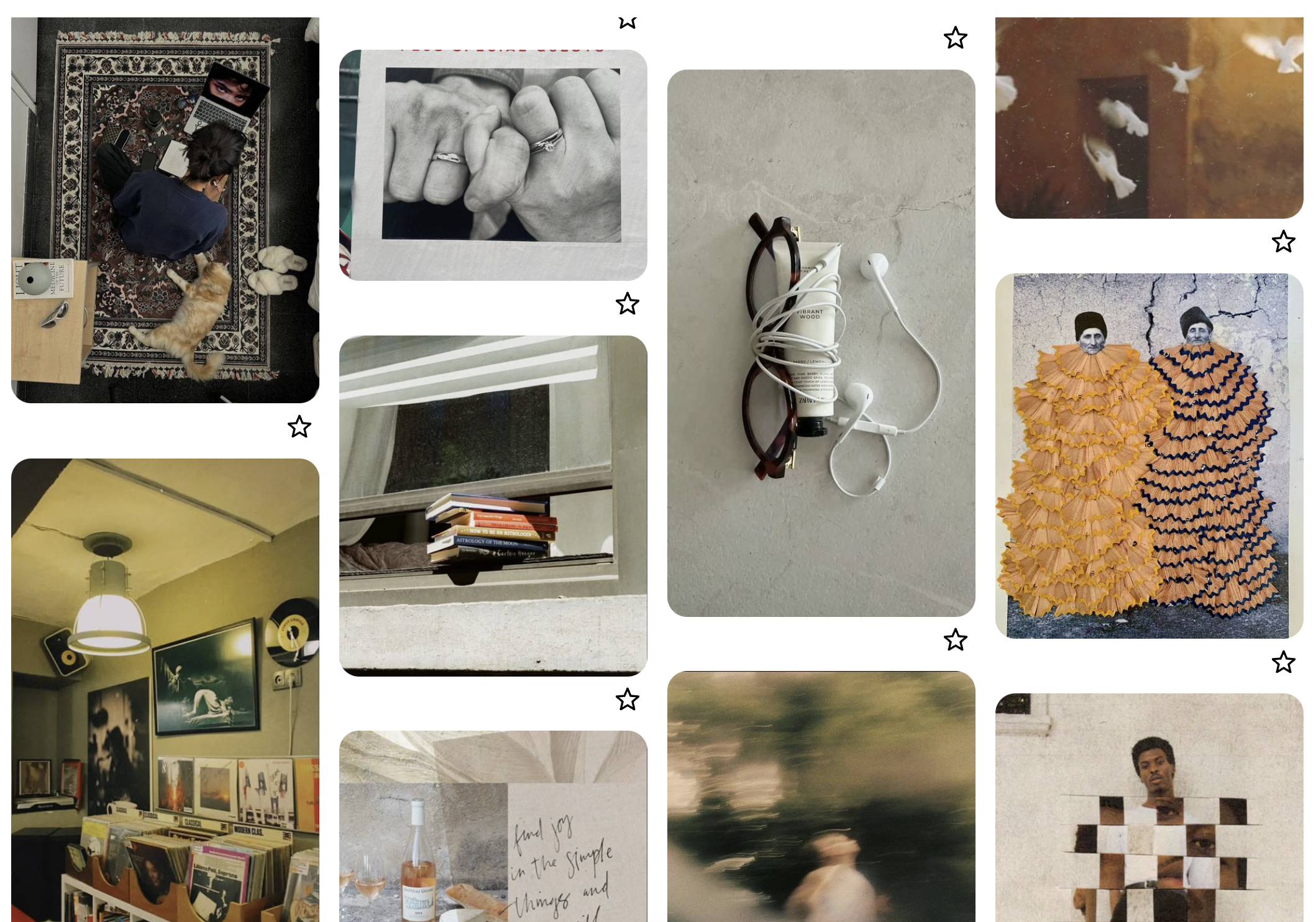
i’m a pinterest girly
click to see the moodboard
Outlander Magazine article I referenced earlier:
Read Here
Corded headphones (amazon affiliate link) if you know of a local place that sells headphones, i’d rather link those.
Retro digital camera (again this is an amazon affiliate link) if you know of a local shop that sells these, let me know!
- j